Physical outcome: 64 Page World Dictionary of Happiness
Issuu link here
Digital outcome: 3 minute 3 seconds Animation
- - -
Initial notes and thoughts
Consider a collision of concepts, people, mediums, ideas etc..
Is it memorable enough to be shared?
Memorable, emotional, storytelling
Make something - digital and physical
Animation, posters, book, interaction with the audience at the event
Ink & Pixels
Consider:
HAPPINESS;
- What is it? what makes you happy?
-Sagmeister. Being happy with experiencing design & being happy designing
- The visualization of happiness.
- Who makes you happy? -Can we make ourselves happy? Do we need other people? -Can/do we always need to be happy? - Happiness through harmony -Do we need happiness and sadness to appreciate the happiness? - The Pursuit of Happiness - Is happiness something we find or experience?
INTERNET & DIGITAL AGE:
-How has it changed us/our lives? What else could it do for us?
- Douglas Coupland - The Post Internet brain.
- Connecting with people in and out of the room
- Tim Berners-Lee - What does it do for us? - Is constant connectivity good for us? -Disconnecting from reality? -How involved are the government & big companies? - Who's watching? -Who's watching the watchers? -How do you police it? -Has it gone too far? -iPhones and Smartphones, is it truly safe & secure?
YOUR FUTURE SELF:
-Who will you be in 10 years time? How would you represent the future?
- " When I'm a Dad " - Tom Watkins
-Who/what/where/how will you be in 10 years? -Can we predict it? -How do we prepare for it? -Should we focus on the here and now? -Write your own future -Does the future need a plan b? -Will you/I be happy? -Will we still be chasing the same goals/the pursuit of happiness?
Research
Initially I wanted to pursue an idea based around an idea of "happiness through harmony", this was inspired by some of my old college work that I found whilst trying to sort out my portfolio.
So I produced a questionnaire to get some more information around this idea and peoples wider thoughts on happiness.
These are the questions I asked people as part of my survey.
1 - What makes you happy? (List as many things as you desire)
2 - Do we always need to be happy?
3 - What is your response to the statement;
"We need bad times to appreciate how good the good times are”?
4 - What is your response to the statement;
"Happiness is a harmony or balance of different things”?
5 - Is happiness something we find or is it just a temporary experience?
6 - “A quest in pursuit of true happiness will never end.”
Do you agree? Yes/No
7 - What is happiness?
To me the most important answers, were the responses to questions 1, 5, and 7. 1 & 7 because I feel like the answers to these questions would give me a good idea as to how to relate this project to real people in the real world. And question 5 was important because I had already began to formulate am idea which revolved around this idea of ‘happiness is a harmony’.
However, whilst waiting to get an acceptable number of responses to my survey, I came across another idea whilst doing some research on happiness. I found an article about a survivor of the Holocaust who had wrote a book about the difference between living a happy life and a meaningful one. In the article it is explained that Polish, Russian and other non-English speaking nations tend to be more conservative in the use of the word that is often translated as “happy” or “happiness”.
This got me thinking about how happiness and expectations of happiness, as well as what makes people happy, can change between cultures and countries, for example Latin American countries are stereotyped to being happy than Americans, who in turn are stereotyped to being happier than Russians. So I decided to shift my focus to looking at happiness across different cultures.
After being inspired to take a new direction with this project, I began to look at the differences in happiness across different cultures. During my research I found a journal article from the University of Southern California (USC), which looked at the concepts of happiness through time and across cultures.
The concepts of happiness centred on favourable,external circumstances in Ancient China and Greece, whereas they centre on positive inner feeling states in the U.S. today.
Happiness in American English today covers a wide range of positive feeling states, whereas happiness in Polish, Russian, German, and French is used to refer to a rare event or condition.
The cross-cultural dictionary analysis revealed that the use of happiness to convey fortune, fate or luck was present in 80% of a sample of current international dictionary definitions, so this use is not relegated to just ancient China and Greece, however this use fell into disuse in American English in the 1920’s.
1920 was the year consumerism really started in America. “A personal experience” centred approach to advertising boomed, aiming to appeal at emotions as well as using smiles and cheerfulness in advertising to portray the pleasure of using the product. Shifting mindsets to self-satisfaction.
The differences in the definitions may be down to happiness being used in different contexts, and being a different concept to the one English speakers are used to. Different cultures may have different connotations.
Does the meaning of happiness depend on the age of the person using it? Young Americans use it in connotation with excitement, whereas older Americans use it to relate to peaceful feelings. Previous research found that older people tend to be happier than younger people, this could be down to the connotative differences in the word.
Does religion / religious traditions have an influence on the meaning of happiness, or a person being happy?
To back up this research about the definition of happiness across the 30 countries sampled in the report, I wanted to know if there was a difference in the happiness of these countries, as part of this research I found that the United Nations produce a more comprehensive report that covers 158 countries and asks the populations of these countries to report back how happy they are over 6 different categories using a scale of 1-10, with 10 being the happiest and 1 being the opposite etc... The countries are then ranked based on an average score of the population.
I then cross-correlated the two reports to give the most complete information for the countries that include in both reports. The 30 countries are featured in both, along with their language (or the one used in the dictionary definition) with their UN World Happiness Report Ranking (1-158) and their happines rating (1-10) are;
Argentina (Spanish), 30 / 6.574
Australia (English), 10 / 7.284
Brazil (Portuguese), 16 / 6.983
China (Chinese), 84 / 5.140
Ecuador (Spanish), 48 / 5.975
Estonia (Estonian), 73 / 5.429
France (French), 29 / 6.575
Germany (German), 26 / 6.75
Guatemala (Spanish), 43 / 6.123
India (Hindi), 117 / 4.565
Indonesia (Indonesian), 74 / 5.399
Iran (Farsi), 110 / 4.686
Israel (Hebrew), 11 / 7.278
Italy (Italian), 50 / 5.948
Japan (Japanese), 46 / 5.987
Kenya (Swahili), 125 / 4.419
Malaysia (Malay), 61 / 5.770
Mozambique (Portuguese), 94 / 4.971
Norway (Norwegian), 4 / 7.522
Pakistan (Punjabi), 81 / 5.194
Portugal (Portuguese), 88 / 5.102
Romania (Romanian), 86 / 5.124
Russia (Russian), 64 / 5.716
Senegal (French), 142 / 3.904
Singapore (Chinese), 24 / 6.798
South Africa (Afrikaans), 113 / 4.642
South Korea (Korean), 47 / 5.984
Spain (Spanish), 36 / 6.329
Turkey (Turkish), 76 / 5.332
United States (English), 15 / 7.119.
For the sake of the animation I decided that I should cut this list down to include the happiest and the least happy, as well as a selection of different countries from each of the continents to give a better view of how happiness is represented across different cultures. I chose Norway as they were the highest ranked in the dictionary analysis report, and Senegal were the least happy. I then selected Germany to represent Europe, Argentina to represent South America, Korea to represent the Asia and Oceania, Pakistan to represent the Middle East, South Africa to represent Africa, and the USA to represent North America. This is a good wide mix of different stereotypes, languages, cultures as well as varying political, religious and social structures.
Physcial Outcome Development

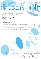
These are two poster designs that are based around the same design of the cover of my research and development work which uses the split idea of the title, surrounded by shapes of varying colours, shapes, and styles.
I liked this idea to start with because it fits with the idea of collide, collisions and overlapping, but at the same time I didn't feel that initially using the shards were friendly enough to relate to the theme of happiness.
I then changed the shards to a friendlier, happier shape of circles, however I was still unsure that the idea was good enough to pursue so I shifted my focus onto producing the animation, with the hope that when this was completed I would have a better idea of where to take the physical side of the project.
Once the animation was complete I came back to this idea, and felt that using this style would not produce the best or most appropriate outcome, as I felt that having a range of posters that explained the dictionary definition of the same word across a range of languages wouldn't be very interesting.
So I decided that the best thing to do would be to create a dictionary for interested parties to pick up and learn about happiness in the 30 different countries, this way interested people could take their time to leaf through it and read the definitions at their own pace.
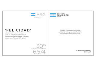
These are the four initial page layout ideas I had. Two were more minimalist and simple - with all the content sitting centrally, whereas the other two were a bit more dynamic with elements at different widths and heights.
Given how dynamic and vibrant my animation is I felt that it would be best to use one of the more dynamic layouts as these gave the best options for adding colour to a second page in the spread.
 Each of the main pages contain the same information - the flag, country name, the local word for happiness, the local dictionary definition as well as the information from the UN World Happiness Report.
Given the feedback from some of my peers I decided to use the idea on the bottom left and tweaked it a little, by bringing down the point sizes and adding a little bit more space in the main body.
 These are some of the spread options open to this design. The right hand page is what right handed people see as they quickly flick through the book so I thought this would be a good place to put the headline which is the local word for happiness. I decided this should be coloured to match the countries national identities to help readers forge an association with the word and the country, as well as easing navigation. Given that the left hand side was mainly black on white I decided the second page should be a flash of colour to liven it up a little bit. And I carried the line across just to help the readers eye cross the gutter between the pages.
I then applied this style to the each of the 30 countries featured, using their national colours or the colours from their flag.
Digital Outcome development
 For my digital outcome, I had decided from the outset that I wanted to produce an animation, this was because I felt this was the easiest and most appropriate thing to do, I also have really enjoyed working in AfterEffects the last two years, and used one of the Process and Production pieces we produced in the first year as inspiration.
Given the subject matter and content I thought it was best to do a kinetic type kind of piece which involved bits of text moving around the screen to give the animation some life.
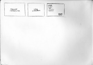
I started off by doing some sketches and vector story-boarding. This was to get the layout down for each of the frames as well as seeing if the sizes of the elements such as the text and flags, were appropriate for viewing and reading.
I then went into AE to begin to recreate the layouts in After Effects and begin to tie the segments together. This is the first version of the animation which is very rough.
After completing the first version I decided that some of the timings were either too slow or too quick, sometimes leaving too much time between segments or too little. I also thought that there wasn't much life in it, and it needed brightening up. I also felt that overall, the animation was just too long, so needed cutting down.
The second version is much quicker in terms of pace, and is also a lot more friendly to look at, because of the colours I have used as well as livening up some of the transitions with some new effects. I have also cut a lot of the dead time out of the animation, shaving nearly 30 seconds off.
I still feel that the layout could do with some work and that the sliced effect might not be entirely appropriate even thought it does add something a bit more interesting to the work, and the fade in and move effect relies on this sliced effect.
In the final piece I have tidied up the sliced affect for the country codes as well as neatened up the layouts for the text heavy segments, as well as tweaking the sizes and timings to make it more viewer friendly when it comes to reading the text.


