Showing posts with label Process and Production 2. Show all posts

Thursday, 21 April 2016

Cinema 4D - Mapping textures

Today's process and production session took place in Cinema 4D and was based around Mapping textures on a few different objects.

We started by downloading the files Jay had prepared for us from unilearn. We started by opening the can shape in Illustrator so that we could prep it for use in C4D. This was just resetting the zero point in the document so that the 0,0 was at the base of the can and in the middle of the page. This makes it easier to convert the shape into a 3D object. The paths had to be saved as a legacy version of illustrator - illustrator 8, otherwise C4D wouldn't be able to process them,

The next step was to put the file into C4D. Once the file was in place, we had to take the paths out of the group that they were in. We then created two lathes from the sub-divison surface menu, the two paths were then dragged into a lathe each. This creates a 3D object from the paths, maintaining the height of the path and rotating it around the long edge, as if it were being spun on a lathe. This resulted in us having the can shape - complete with top.

We then created the floor and background using the tools in C4D, before adding a compositing tag to the floor. This makes the floor and background join seemlessly - giving a much more professional appearance. We then added a material to the floor and background to give it some colour.

Next we began working on the materials for the bottle. We made a new material in the material tray at the bottom of the work space. Keeping the reflectance turned on, removing the default specular layer before adding a new reflection (legacy) layer. In the settings we also added a fresnel property, changing it to dielectric and changing the preset to PET (a plastic). We also reduced the global reflection brightness and the global specular brightness to 50%.

As part of the colour settings you can add a texture - we did this to import the artwork for the can. This new material was then dragged into the lathe to apply it to the objects within.

Once this was applied we had to tweak some of the settings so that it would be right. We had to select the material tag, and change the projection to cylindrical, and turn off tiling. The last setting was to right click on the material tag and select 'fit to object', we selected yes when asked to apply to all subcontents.

We then made another new material and followed much the same process. Removing the default specular, adding the reflection (legacy) layer. But we changed the layer type to GGX, changed the roughness to 20%, and also tweaking the colour value in HSV so that it was v = 36 % - roughly. We then changed the global specular and reflection brightness's to 50% each.

We then dragged this new material into the second lathe for the can top.

Next, we added some studio lighting. The key light was set up at X 500, Y 1000, Z -500. We then rotated the viewpoint so that this light was sitting in the top left quadrant - as if it were over out left shoulder.

We then added the settting by going into the mode menu, finding the view settings and selecting view, before scrolling down to the shadows, and adding them to give a more real world application.

We then copied the key light to make a fill light, and changing the co-ordinates to X 500, Y 1000, Z 500, and dropping the intensity in the general menu to 50%.

We then added a third light - this time an area light. This light was placed at X 500, Y 40, Z -400, with a rotation at heading 45.

We then rotated the can lathe using the rotate tool to get the best angle of the can for the render.

To increase the shadow sharpness, you can change the shadow resolution in the light settings by selecting the light, going to project, and the shadows menu, and changing the resolution to make it sharper or softer.

We also increased the smoothness of the circumference of the top and can to make it more hi res by changing the object subdivisions to a higher number, and this helps smooth out the circle by increasing the number parts that it used to make up the shape.

Once we were happy with all the aesthetics of the render, we altered the render settings.
The output was set to A5 Print (portrait), frame range was set to the current frame only, the format was set to a high quality JPEG (with a quality of at least 85% - I choose 100). The anti-aliasing was set to best, with ambient occlusion turned on with the max ray length set to 50cm and a dispersion of 50%.


The next part of the session was spent creating a bottle, which roughly followed the same process as the can.

We followed the same process, setting up the Illustrator file for use in C4D, importing the file, and setting up the 2 lathes, as well as creating the seamless floor and background.

The first real deviation in the process was where we went into the content browser (which is in a tab on the far right hand side of the screen). We went into the presets - broadcast materials - glass - glass stained to find the right material for the texture of a glass bottle. This placed the stained glass material into the material tray at the bottom of the screen.

We altered some of the settings in the material - taking off the bump settings, changing the transparency refraction to 1.2, changing the absorption colour to white, and changing the HSV colour so that the V was 80%.

We copied the material and changed the colour to a pale yellow for the liquid - supposed to be beer. The glass material was added to the bottle and the yellow was added to the liquid.

We then created another new material this time, and turned on the alpha channel. We followed this by creating a cylinder with a radius of 73.5 and a height of 240 - this was to be the label band.

We changed the bottle lathe settings so that the number of subdivisions matched that of the cylinder which was higher - 36 - ergo making it higher res and smoother.

Back to the cylinder and we changed the caps so that they were off - creating a hollow tube.
Next we added the artwork for the label. In the cylinder settings, in the alpha channel you can add texture and we added a png mask of a beer label to create the effect of the label being in two parts - which higher quality brands use - rather than the single wrap around label which cheaper brands like Budweiser use. We had to use the invert option in C4D as Jay had masked off the wrong areas in his prepared file.

Even though the artwork seemed to fit, we had to alter the settings, to make it suitable if we had to change any of the sizes of the other objects. So we went into the material tag, and changed the projection to cylindrical, unticked the tile option, and fitted it to the object via the right click menu.

To make it look like the sticker was only printed on one side, we had to duplicate the material in the material tray, clear the texture in the colour menu, and reorder the material on the cylinder so that the new blank layer was underneath the artwork - giving the appearance that the back of the label is white.

To give it a more realistic appearance under the lights we removed the default specular, added the reflection (legacy), changed the layer fresnel to dielectric, and reduce the global specular and reflection brightness to 25%.

To make the bottle cap we had to make it from scratch in C4D. We started off by making a new document and creating a new shape. Using the pen tool menu to select the star shape. We altered the shape settings - object plane x2, with an inner radius 33, outer radius 37, with 20 points.

We then created series of 4 circles using the circle pen tool, the first with an inner radius of 33, the second with an inner radius of 29, the third had an inner radius of 17, and the last one had a inner radius of 0.

All these new shapes were then placed into a new loft within subdivision surface. The last 3 circles where then dragged up a little bit in the Y axis so to create the depth of the bottle cap. We then turned the caps off within the loft. Next we changed some of the object settings - changing the mesh subdivision U to 40, the mesh to 4 and the isoperm to 3, and switching the organic form on.

This was followed by creating a new cloth surface - this is achieved by going through the simulate menu to cloth and cloth surface. In the object settings we changed the subdivisions to 2, the thickness to 1 cm and we also switched the limit on.

We add the material as we had done previously. We added a bottle cap artwork/texture that Jay had prepared. We changed the projection tag to flat, and changed the artwork to fit the object, agreeing to apply it to all sub-contents. We again unticked the tile option.

We then used the texture mode from the left hand side of the screen. Using this in combination with the rotate tool we rotated the artwork so that the logo sat in the middle and top of the cap. This was made easier by holding the shift key as this moves the rotation in ten degree increments. We again fitted the artwork to the object.

We then collapsed the layer/object stack in the top right window and copied the object, pasting it in the bottle project. We then had to drag the bottle cap up in the Y axis so that it sat in place on top of the bottle.

The final stage was to export and render the images. This was the same process as the can, with anti-aliasing turned to Best, the ambient occlusion of ray length 50 cm and the dispersion to 50.


After the session finished, I spent some time changing the artworks and background to match some of the work I did earlier this year, expanding on Zombones range, branching into beer with Zombooze in the bottle and Zombjuice in the can. I also altered the slogans to match.


Thursday, 14 April 2016

Showreel Production

This Wednesday's process and production workshop was based around the production of a showreel, compositing all the After Effects works we've done this year, into one clip, as a way to quickly show off the range of skills we have, and garner interest, and point people towards an online presence.

We started by finding some background music, that fitted with our work as well as being suitable to cut between different videos to. We had to cut it down to the required amount, leaving it to run a little longer than the visual comp just to have a safe space to work in. The next step was to import all the footage we had made previously so that there was 50 seconds of content plus the music in AE.

The next step saw us move into Illustrator to create the title and end slates - something that would help start and end the showreel as well personalise the content to ourselves. For the title slide I used my personal branding, which includes my logo, colour scheme, and font family (Raleway).

To help with the branding, I added my name, and the title, as well as the year. On the endboard I added a copyright notice and a link to my other animation work on Vimeo.

For the structure of the reel, we were told to put a good piece of work - one that we would like to do more of in the future. This would then be followed by a better piece of work to show improvement. Any less good work would then follow this, before, building up the quality again before the finish. The end piece should be something that you would be willing to talk about - as if you were watching it with any potential clients or interviewers.

Once this was ready, we began to set up the timeline with the projects in them to the desired order, as well as matching them up with the music. I then went back and shortened the desired clips so that it would cut/transition to another piece of work. And added effects to the transitions because I felt this matched the music more.

Animation showreel 2016 from Matt McGough on Vimeo.

Wednesday, 16 March 2016

3D Communique 3

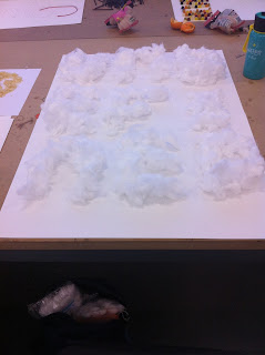
The third and final session from Deaks' 3D analogue communique session was focused on producing the final outcome. My time was spent sticking balls of cotton wool to fishing line in preperation for making a mosiac-like construction of the individual letters.

Given how long my original word of 'undefined' was I decided to use a shorter synonym to save time - as this was a lengthy process. I googled synonyms for undefined and settled on the word vague.


The next step was to set up the rig for suspending the balls of wool. This was done by spanning three lines of the fishing line between a wall of the studio and one of the fake wall/partitions that was hanging around the studio. The three lines were secured in place just by using the masking tape that was used to secure the fishing line to the cotton wool - as I can't really tie knot using the line.

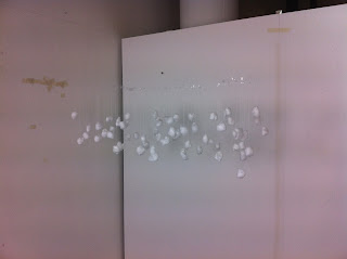
Then I started to hang up the bits of the wool from the lines. I started off with the middle letter so that I had a better judge of the spacing between the letters. The G was also the most complex letter to sort out because of the number of components involved, as well certain areas having three different levels on top of each other. I then worked outwards from this til the word was complete. I started by attaching the wool to the lines by tying knots, but this was too fiddly and changed to using some clear sellotape to preserve the lack of definition in any of the elements.This is an almost finished - process shot, without the E on the end.


These are some of the different viewpoints that show that the amorphic art works, as the word is indistinguishable from above, below, and from either side.


From this angle you can make out each of the different letters in the word.

I would have liked this effect to be more clear, but I think this would have taken days to set up, and it would have needed to be scaled up, in both size and number. Also I would have liked to use some stronger line because with even how little a ball of cotton woo and some line weighs, when its all combined together the middle of the line begins to sag. This meant that I had to adjust some of the pieces once they were all on, as well as constantly bringing the lines back to tension every couple of minutes. There was also a couple of times were the lines fell down because they were only secured by tape.

Friday, 11 March 2016

3D Communique 2.5

After the last session of Deaks' session it was agreed that I should try testing out my idea as a kind of proof of concept.

I went about this using some cotton wool, some fishing line, some masking tape, and some of the shelf space around my flat.

I started by trying to tie the balls to the fishing line using knots, but I struggled with this as the line was fine and the cotton wool would lose its shape when you tied the line tight enough to secure the cotton wool.

My next attempt was to unroll the balls of the wool, tape the line to the inside of the wool, and then roll it back up into a ball shape, hiding the tape on the inside.

Once I had repeated this process with a few different bits of wool to have enough to make the shape of one of the letters - in this case the letter U.

The next step was starting to hang it from the underside of a shelf. I did this just by taping the top of the fishing line to the underside so that the cotton wool dropped down. I did this again and again, moving backwards and forwards to create the differing level of depths, as well as moving to the side to create the shape of the letter.

I was pleased with how this looks as it really works with the idea I was trying to work with such, similar to amorphic art, where it only really makes sense from one particular point in the room.

Here is the front shot of the experiment and it shows that the concept works, as you can clearly make out the U shape from this angle, whereas you cant from the side shot.

Wednesday, 9 March 2016

Cinema 4D, session #2

We started the second session in C4D much like we did the first, by creating the all the necessary folders on the desktop, ready for all the content as and when it was needed, as well as establishing good working practices. Creating an umbrella/root folder which had three folders inside it, one each for the Artwork, Maps/Images, and output.

The next step was to start creating stuff inside C4D.

PART I


We started off the first part of the session just by creating a rectangle that sat within the XY plane. We then extruded this rectangle, changing the z-axis extrusion to 5,000 cm, whilst adjusting the subdivisions to 50 to add more polygons. To view these polygons we changed one of the display settings to gouraud shading (lines). 

We then adjusted the caps of the edges of the extruded shape to none on both the start and end caps.

The next step was to add a twist to the extruded shape, this is done by adding a twist, and then dragging it into the extrude. When this had happened we changed the settings of the twist, changing the angle to 10 degrees and the mode to unlimited. Using the co-ord values we also changed the rotation to 90 degrees.

Next, we created a new material, this is done by double clicking in the bottom tray. We ticked off the colour and relfectance settings and ticked on the luminescence settings. You can add a texture, and here we added a checkerboard pattern. To adjust the properties of this checkerboard, you double click the swatch. we changed the U tiles to 0 and the V tiles to 50.

Select the rectangle and go into the object menu and select the intermediate points option, changing it from adaptive to subdivided, adjusting the angle setting to 5 degrees and the max length to 5 cm.

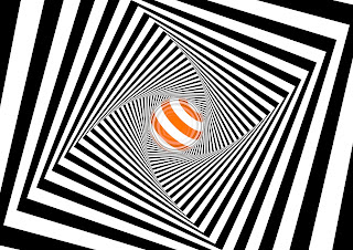
This was followed by creating a sphere with a radius of 40 cm, at 0,0,0, with a pitch of 30 degrees and a bearing of 40. To this we added a new material, again with the colour and reflectance turned off, but with the luminance turned on. Again we added a checkerboard texture, but we changed one of the colours - I changed mine to orange. We also adjusted the frequency of the checkerboard pattern, this basically adjusted how small and frequent the lines were on this new material. The U frequency was set at 0, and the V frequency was set at 5.

We then turned on the reflectance, adding a reflection (legacy), then selecting the layer colour option, going to texture and selecting Fresnel.

The next step was adding a camera, at 0,0,0, with the heading, rotation and bearing all also set at 0.

The final step of this part was to just render it. 
We opened the render settings, and changed the output to A4 Landscape, with a resolution of 300 DPI, the frame range was set to the current frame.
In the save options, we changed the format to JPEG, and altered the quality to 80% in the options. We also changed the anti-aliasing properties to best to sharpen and smooth some of the pixelated lines.


There was the option of adding Ambient Occlusion in the effects menu in the render settings, this added some realistic shading to the composition, most notable here in the joins between the faces of the rectangle.


Before the next part we altered the rectangle shape and changed it to a star shape. This is done by creating a star shape, roughly the same size as the rectangle, we used a 5 point with a inner radius of 75. Once created the star was dragged into the extrude layer and placed above the rectangle in the hierachy. Here is a rendering of this except I have adjusted the ambient occlusion to give a more pronounced shadow effect.


PART II


We saved the previous part and then saved as, to create a new file from the previous work, that would be overwritten without losing it.

In this new file, the first thing we added was a particle emitter which is done by going into the simulate menu, going to particle and then selecting the emitter. The emitter is automatically placed at 0,0,0, so we needed to shift it in the z-axis to sit inside the extruded tunnel shape. We set it to the value of 70 in z-space.

Some of the other settings we changed for the emitter was the particle - stop emission 200 frames, speed 200 cm, rotation 360 degrees , and we also ticked on show objects and render instances.

We then dragged the sphere shape into the emitter layer to make the emitter emit sphere's. We then changed the sphere settings as it was a bit big to have more than one of the sphere's in the tunnel at once, so we made the spheres smaller.

We then changed the emitter settings - adjusting the angle horizontal and verticle both to 60 degrees

The next stage was to add tags to the objects to stop them slipping through each other.
The extruded shape needs a different tag to the sphere. Select the extrude, then go to tags, simulation tags,and collider body.
The sphere needs to have a rigid body tag from the same menu and sub-menu.

Then we selected the extrude and went in the tag menu, but this time from the collision menu, the shape needs to be changed to static mesh.

In the mode window we changed the gravity settings to be a bit dynamic, going into the mode window, the project subsets, go to dynamics, then general and change the gravity setting to 0 cm.

You can alter the number of shapes that are produced by the emitter by adjusting the birthrate editor and render to suit the number of particles you want.


PART III


Part III was a completely new project within the context of todays session.

We started off with adding a floor to a new composition, and then a new background. We added a tag to the floor by selecting it, going to tags, then Cinema 4D and selecting the composting tag. We then had to tick on "compositing background", this would add a seemless join between the floor and the background, removing the line where the floor meets the wall/background.

The next step was to add some text, we did this by going to the MoGraph menu and adding MoText.
We started off by changing the font to one with a big serif such as Superclarendon, we changed the depth to between 50 and 60 - I chose 60, the caps were changed (both the end and start) we changed to fillet caps with 3 stepped corners/edges with radius' of 0.5 cm. We also had the option of changing the text - I changed mine to my initial M.

This was followed by creating a new material. This followed the same pattern as the other materials created today in that the colour was ticked off, but the luminance and reflection were turned on. 
The reflection was changed to add a reflection (legacy) layer. The layer colour was changed to a Fresnel texture layer.

Duplicate this material to make a new one, and with this new material double click to open the properites. In the luminance tab go to the texture option and select gradient. Double click this gradient swatch in order to open up the gradient properties. Next to the gradient bar there is a small arrow, which you need to click to open out. The interpolation needs changing to none, and the white flag needs moving in from the right to 80%.
You can drag this material onto the letter.
In the tag window you can change the tile settings, the U setting needs to be between 30 and 50.

Make another new material, this tie making it blue, and drag this onto the floor and background.

In the render settings, edit the anti-aliasing to the best option.

In each of the shapes you can edit the reflectance/how reflective the material is, by adjusting the Global reflection brightness to a lower value such as 50%, lighter tones will be more reflective.

Then we used the MoText tool, and the material tag to alter the projection option to preference, I chose the Spiral wrapping option. Next we added more text to the piece. Using the MoText tool, add a word that is a bit longer than the width of the initial letter, otherwise the effect isnt very good, and adjust the settings so that the word is smaller than the letter, by using a smaller height/point size. Using the cloner tool, clone this new word using a grid array. We altered this so that the settings were 1, 2, and 2, with a size of 700, 70, and 70.

Next, using the cloner tool, set this new grid array of text that it sat centrally above the first letter in the Y-axis, and using a change in the viewpoint make sure that the two ranks of words are sat directly above the initial letter.

Following this, you need to add the appropriate tags to each of the elements.
The floor, and the big, initial letter need collider tags (found in the simulation sub-menu within the tag menu), whereas the cloned text needs a rigid body tag.
In this rigid body tag there are options that need to be altered, there inherit tag needs to be changed to apply tag to children, and the individual elements option needs changing to all.


After the techinal side of this was all set up and working correctly, I went back and tweaked some of the settings, for example I changed the font to Raleway and the colours, to match up to my personal branding which is mainly orange, with white, and grey.


PART IV


Part IV required another blank file.

This started with the creation of 3 different polygons, 1 was 200 x 2, a second was 70 x 70, and the third was 3 x 200.

To accompany these 3 polygons, we were asked to create 8 new materials - all had colour and reflection off, with only luminance turned on. One had to be white, another had to be black, and the other 6 could have been any colour we chose.

This part of the session required the use of the particle emitter, so we added that in again from the simulate menu, but we had to change the rotational position of it to -90 degrees so that it was facing upwards.

The next step was to duplicate the square polygon 6 times, so that with the original included it totaled 7.

We then went back to the particle emitter and adjusted the horizontal and verticle angles so that they were both 60 degrees. We also changed the birthrate so that it was 20 and 20. The stop emission was changed to 200 and the lifetime to 500. The speed was set to 10 and the end scale was set to 1, both each set with a 20% variation.

This was so that the polygons would grow and move at different speeds with a certain degree of randomness. We then dragged all the polygons into the emitter layer. The show objects options had to be ticked on in the emitter options.

The final step of this part was add some text, for this we again used the MoText tool. The depth was changed to 0. The co-ordinates were changed to x=0, y=600, and the z=0, the rotational was set to -90 degrees. The text alignment, copy, and Y-positioning may need some fiddling with depending on what the copy is and personal preference.


---

When saving the files for animation the render settings need to be changed.

To save as an animation the output needs to be changed to "HDV/TV 720 25"
The frame range needs to be changed from current frame to all frames.
The format needs to be changed to QuickTime Movie, in the options menu, the compression needs to be changed from Animation to H.264 (and you can untick the keyframe option(s))
The resolution needs to be at 72 DPI to avoid massively long render times
Having the Ambient Occlusion can also slow down render times.

Wednesday, 17 February 2016

Fairytale Infographic

Today's Process and production lesson was on After Effects with Sara. The session specifically focused on producing work in a short turn-around, and as such we weren't asked to prepare in files in advance.

In the session we were asked to create two separate scenes from a fairy-tale, and asked to include some kind of information or statistic from the story in the work. I chose Goldilocks and the three bears, because the number 3 is a recurring number and would be easy to include some kind of information on the screen.

I chose to create a wider, map style scene to act as a background for a title screen, and the scene where Goldilocks is trying the three different bowls of porridge.

The scenes were made in two different Illustrator files, just using flat vector shapes, with each element  such as the trees, the bowls, the house, Goldilocks etc on a different layer. We also created a third file for the transition/wipe which needed to fill the full 1920 x 1080 frame at least once to cover the cut between the two different scenes. I did a massive bear paw print that comes in from the bottom, scales up to fill the screen and then moves off the top of the screen at the original scale.

We then imported each file into After Effects. If the artwork wasn't finalised it was best to import the file as a composition, but in order to work faster it was better to use the composition retail file size option. For each of the compositions we altered the duration to just 5 seconds (the two scenes together would add up to the usual 10 seconds). The wipe composition was set to a 1 second duration, because it only had to be brief enough to act as a transition rather than a whole scene on its own.

When using text, its often better to use the text tool within After Effects as you cannot add text effects to imported text files/layers. So once we had added the text in AE we added effects to the text for it to animate in, this is done by selecting the text layer in the timeline, going to the top bar and going to animation > apple animation preset and then finding the presets in the Adobe After Effects folder, seen as we wanted the text to animate in we selected the "animate in" sub-folder. After trying a few different ones I decided to use the slow fade in preset as this gave the best effect for my work, as it wasn't too ostentatious.

The next thing we tried was a tilt shift. This was done by importing a subtle paper texture into AE and into a new composition, dragging the desired scene into said composition and turning on the 3D switch. Using the 3D properties we twisted the paper texture using the x and y axises, and moving them back to a flat plane at the end of the clip, this would add some subtle depth and dynamism to the background. To get a depth of field type effect, which softens up the background and foreground you can add a new adjustment layer on top, adding a Gaussian blur, and using a marquee tool to mask out the subject and keep the desired area in sharp focus.

I tried this and felt that it didn't really add anything to my piece.

Given more time I would have liked to add some more scenes and neatened up the starting and ending as at the moment I think they are a little abrupt and something smoother would look better.

Tuesday, 16 February 2016

3D Communique 2

This was the second of this terms process and production session with Nick, which focused on developing the ideas we had in the first week, and turning them into physical specimens. I decided that I wanted to use cotton wool. I liked this idea because the nature of the wool would allow me to fluff out the edges and kind of blur out the shape of the letters, posing a question of where the shape definitively began.

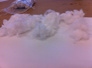
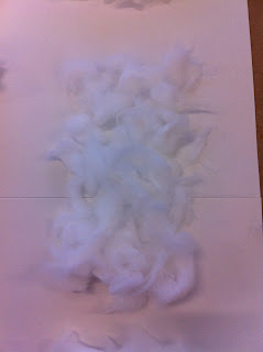
I started out just by making the shape of the letters by tearing apart the cotton wool and fluffing it up a little bit, and using different bits to make up the shape of the letter. This gave two effects, it added a bit of depth as bits piled on top of each other, as well as the desired the fluffy effect.

The next step of the process was to begin to think about the next development. My idea was to take it a more 3D solution which used a twist on perspective, and anamorphism. Using string or fishing line to hang individual pieces of cotton that would only make sense from one particular view point, and would just look like pieces of cotton on string from all over.

This would involve having different levels of string set up behind each other to give depth. The cotton wool would have to be on pieces of different length in order to form the shape of the letters. If done correctly the piece should look as if the cotton wool were all at the same level, merging together to form the desired word.


Wednesday, 3 February 2016

Cinema 4D #1

Today's process and production session was the first session in Cinema 4D, in which we spent the session just getting the hang of working in the software.

Firstly we had to have some artwork, which we made in Illustrator. I used a vector form of my personal branding. It features an M with two concentric circles, with the outer circle being broken into 3 arcs. For this to be compatible with Cinema 4D we had to convert any text to paths by creating outlines. It was recommended that any longer bits of text should be avoided as text can be added in C4D. Mine was fine because it was just an initial.

This was placed on a document that had been altered to work using C4D's 3D space. The default setting for Illustrator is to have the origins set to the top left hand corner, because Illustrator is used to create flat vectors it only needs to have two axis' (X and Y), but given that C4D uses 3, where the origins all meet in the middle. We needed to move the origin points from the corner to the middle of the page, we did this by turning on the rulers, and then moving from the top left corner of the document window and dragging this to the center point of the document, and this reset the origins to 0,0 in the middle of the page.

We then set the artwork to sit centered around this center point. When saving the work, we had to save it as a legacy version as the last compatible version of Illustrator was Illustrator 8.

Next we set up a more professional and organised workflow on the desktop, by creating a folder on the desktop for the project and then creating 3 new folders within this new folder. One each for the artwork, output, and Cinema 4D. This is because in industry where a project may be compartmentalized this is the most efficient way of working.

The next step was entering C4D. W started by editing the render settings. Firstly, changing the output to a print output with A4 Landscape settings, and changing the frame range to current range. We also editing the name that the file would be saved as, changed the file type to JPEG, with the quality at 95%, but we were advised anything above 80% would be fine.

We then saved these settings as a template, before saving an empty file with a proper name to begin the project. There is an option in C4D that allows the file to be saved incrementally to chart progress.

Next we changed some of the view settings, so that there was an darker tint to the edge of the work space window, as well as adding an action safe border at 95% of the full size of the window.

The following step was importing the artwork that we had made in illustrator. C4D does not label this as import or place like Adobe Creative suite instead it is 'merge'. When merging there is an options window and with a scale setting, In this case we just left it at 1.

C4D can read that the imported file is made up of paths, in the window we selected the paths that was under the shape layer and used a right click menu to connect objects and delete. The next step was to drag out all the paths from the shape and delete the null shape.


We then went about extruding the paths that made up our design. We again selected the paths and used the subdivision surface tool and selected extrude. Then we dragged the path into the extrude layer, before altering with the settings of the extrusion. We changed the caps to fillet caps, on both the start and end, as well as changing the bevelled edges to 3 stepped edges with 0.5cm radius'.

Once we were happy with this, we started to add the environment. We added a floor and a background. Because the floor is inserted at 0, 0, 0 we had to adjust the Y-position of our logo. The best way to move it is by using the arrows that appear when a layer/object is selected. The green arrow moves it in the Y, the red moves it in the X, and the blue moves it in the Z-axis. I shifted mine up enough that it looked as if the logo was hovering above the floor.

The next stage was to start sprucing up the work. This was started by adding a new material. This is achieved by creating a new material in the bottom tray by double clicking. You can duplicate this new material by selecting the original and dragging it to the right whilst holding the cmd button. I added three colors; orange and white, (these are the primary and secondary colors in my branding) and a dark grey, as I think this would offset the other colors nicely. The materials/colors can then be applied by dragging them onto the face of the shape, or onto the layer for it to be applied to all of the shape.

This was followed by us selecting the floor and the going to the tags menu. we selected the Cinema 4D tags sub-menu and compositing. We then turned on the compositing background, and compositing background for HDR Maps options.

We then added some text, by selecting MoText from the MoGraph menu. In the text options we changed the justification so that it was aligned center. I added the supporting copy, to sit next to my logo.

Once this was done, we added a camera by selecting add camera from the top tool bar. This is initially added to where the current viewpoint is, this can be seen by scrolling/zooming out immediately after adding the camera. Clicking on the crosshairs in the camera layer in the window in the top left allows you to see it the render from that particular angle.

Next, we added some lighting. We were advised again that when adding lighting you should follow the same principles as photography, using key, and fill lighting. The key lighting was placed over the left shoulder of the camera. We then enabled shadows, by simply going into the general menu in the light, going to shadow, and turning on soft shadow maps. Using a low shadow resolution (around 250 x 250) keeps the shading soft, whereas using a higher res can create a more defined edge. A second light can be added to fill in some of the shadows.

The position of the lights can be changed without leaving the camera view, by altering lights coord settings.

Another one of the settings can be altered to add colored tints. We added a slight yellow tint to the key, using a yellow with a 5% hue, and a blue tint to the fill.


The final step was to add a lighting effect that would add a bit more depth to the work. It was made by changing one of the visible light settings on the key light, turning the visible light on and making the radius bigger so that it extended beyond the artwork.


Overall I am quite pleased with how my first attempt at working in C4D went. I found the process to be quite simple, even if there was a few times where I got a little lost whilst working with some of the camera/viewpoint controls. This is certainly something I would like to do again, and perhaps refine the use of the lighting, to give a more desirable outcome, as I feel that I may have implemented the last step incorrectly as it doesn't really add anything to the composition. I am really happy with the rest of the styling however as it fits well into existing branding I have produced, however I would like to perhaps tweak the colours a little bit to be an exact match what already exists.

I look forward to using and progressing my skills in Cinema 4D.

Thursday, 28 January 2016

Working 3D Space

Todays workshop focused mainly around using After Effects 3-Dimensional capabilities, which primary consisted of giving depth to a composition made up of flat vector shapes (as objects in AE are only represented with a depth of 1 pixel), with a 3D stage using a camera moving in Z space.

We started by prepping the assets in Illustrator. Using 6-8 layers, to create a scene. Using each layer for a different element, I created a setting that featured some of Huddersfield's claims to fame - namely Castle Hill, and a set of rugby posts to indicate that the town is the birthplace of rugby league. Each of these were placed on top of a different hill to represent some of the physical geography that surrounds the town.

Original Artwork

Due to the processes that we would be using, any of the elements that were to feature in the background, or earlier on in the clip would need to be bigger than the standard HDTV art-boards of 1920 x 1080 pixels, this is due to the movement of the camera on the z-axis, objects would shrink into the background, and perhaps reveal the edges - which if undesired can look unprofessional.

We then began to move into AE, creating a new composition at 1920 x 1080 pixels, with a frame rate of 25 FPS and a duration of 10 seconds.
We then moved back into illustrator to finish prepping the assets, the last stage was to extended the art boards so that it included all artwork, even if this was beyond 1920 x 1080.
When importing the Illustrator file into AE it was important to select the option where the illustrator file retained all the layer sizes, as this would make it easier to maintain shapes proportions.

To begin to work in 3D space, first select all the layers in the timeline window, toggle switches and modes and turn on the boxes that are underneath the cube symbol as this enables the 3D options for these layers. When working in 3D space, a objects/layers position figures are given in 3 values, x - representing the horizontal movement, y - the vertical, and z - the depth enable objects to move backwards and forwards. As a default the z axis is set to 0, increasing the value moves the object further away, decreasing it into negative values move it closer to the foreground.

Sara then introduced us to a feature in AE that allows the composition window to be split into 1,2 or more views and the view of the stage can be changed independently in each of these windows, having one set as the top view and one as the active view gives a good idea as to the position of the elements, and how this well effect the final piece.

We then went about setting up the individual elements/layers, moving the background layer to the back of the shot, and then spacing out the layers to give the best visual effect with the movement of the camera in z-space. My work features a rugby ball, whilst the ball was moving towards the background I wanted it to spin, I did this by altering the Y coordinate in the transform, position options.

The next step was to add this camera, by adding a new camera from the layer menu. We added a two node camera using the 35mm preset. Something to consider may be the use of the depth of field option in this window, if you want to have a variable focus in the video.

We got the speed of the zoom/movement of the camera, by moving the playback head to the start, and moving the camera into the desired start position, and inserting a keyframe in the transform properties, and then moving the playback head to the end of the timeline, and moving the camera position into the desired the end shot. A slower effect can be achieved by increasing the gaps between the layers in z-space, having them closer together means that the camera will pass by them quicker as there is shorter distance to travel.

The next technique we were introduced to was how to alter the path that the camera takes. If you want the camera to move up and down changing the top view to a side view gives the best perspective, however I decided that I wanted my camera path to meander around the hills rather than climb them, so I stayed with a top-down view. The next step was to open out the properties section of the camera in the timeline and insert keyframes, if you want to move it up and down you need to alter the Y coordinate, I wanted mine to move side to side so I altered the X coordinate, using the handles found on the points can alter the curvature of the path. For as smooth effect as possible you want to use as few keyframes as possible.

Once we were happy with the positioning, the movements, and the speed of the piece were began to import the textures. Selecting the desired layer and the the wanted texture, and precomposing by going to the layer menu and selecting Pre-compose. A pop up window will open and select "leave attributes...". Then drag the texture under the shape layer, toggle the switches and modes and select the alpha trackmatte. You can add a colored tint by turning the visibility of the vector shape layer on, and altering the opacity and/or options. This should maintain the desired textured effect whilst adding the coloured tint. I changed the colour of the text by adding a coloured tint on top of the texture.

The final stage was adding the peel effect to the layers. This effect is added by adding the page turn effect which is found in the effects menu under effects > distort > Page Turn. We changed the controls to classic UI and played around with the settings in order to get the desired effect.

Thursday, 21 January 2016

3D Communique

Our first process and production session back after the Christmas holidays was with Nick.
We were introduced to the objectives/goals of the new set of workshops that I think are more of a progression of where we left off last term with Nick, in as such that we were producing 3-Dimensional analogue communiques, using the same methodology and phrase as we did last term - if possible.

Last term I used the phrase "I am undefined" and used a technique of shading in to form the body of the letters without leaving a defined edge to each of the characters.

So we spent the first session thinking of ways to progress this and scale it up to the third dimension. Continuing with this idea of leaving no definitive edge and being as vague/ambiguous as possible I came up with ideas that used materials such as smoke, fog/mist or clouds, cotton wool, shadows, pencils in timelapse to create a motion blur effect (similar to the output from last term). I then came up with the idea of using as many different media, shapes, styles, sizes as possible so that it wasn't made from just one thing. Talking to Nick about continuing the undefined message, he suggested that I perhaps use something that wouldn't be immediately obvious, and the message would only be legible from a certain perspective

I came up with different messages that used different media, just incase it became impractical to carry on the Undefined, such as 'Calorific'/'Sweet'/'Creamy' written in whipped/squirty cream, 'scrunched up' using scrunched up bits of paper, 'stacked' made up of boxes, 'more than face value' using a mosiac of small valued coins (1p, 2p, 5p etc), 'Digital' using keyboard keys, '75% water' made up of water droplets made visible with food colouring or ink, and 'rubbish' made up of litter.

Thursday, 10 December 2015

Cereal Packaging

In the final session with Jay we produced the final outcome of this series of workshops - a printed small-scale, mock up, for our cereal boxes. This meant finalizing the designs with any less minute tweaks, getting them printed, cutting them out with scissors or craft knives, scoring and folding the panels, then gluing the tabs together to get the desired box shape.

We then went on to have a little photoshoot with our little boxes, to give them a bit more of a final product feel, making them a more professional presentation, as well as giving us a more professional looking product to include in portfolios.

Zombones, all the nutrition the undead need!

Wednesday, 2 December 2015

Boiling

In our latest After Effects session with Sara we focused on a technique called Boiling.

This technique uses both analogue and digital elements. It starts with drawing and tracing an image, so that in the end you have 3 copies of the same image, this produces 3 very similar looking images, that when viewed in quick succession resembles how water looks when it is boiling.

We started by scanning in the drawn images and importing them into the Photoshop. This was to ensure that each of the elements within the image were in the same place. To ensure that the images were cropped to the same dimensions and positioning, you can select the crop tool, select the area to crop too, then crop, then with the marquee tool you can drag the selected area over to another window, and  hold shift whilst holding the cursor over the second will drop the select the exact same area on this other canvas.

Once all the photoshop files were set up properly, we had to save them at 72ppi, in a naming format similar to name_001.jpg, name_002.jpg, name_003.jpg etc (on a side note, this technique works better with an odd number of files, just with how the brain analyses images, an even number like 2 would just make it look like there was a glitch in the video).

The next step was to then start working in After Effects.
We started with making a new composition, 1920 x 1080, with a frame rate of 25fps, and a duration of 10 seconds.

Then we had to import the saved jpgs, but when importing the files, we selected all 3 of them and turned on the option that says "import as JPG Sequence", and this allows the imported file to be a composition of stills but looks like a moving image in just one layer - making it easier to handle.

Once the imported file was placed in the composition timeline, we clicked back in the project window and went to file - interpret footage main, and changed the frame rate to match that of the composition from 30 to 25. Whilst still in this window, we changed the loop settings to 50 times. This loops the file out to the 6 second mark.

The next step was to select the layer, and go to the pop out menu in the timeline window, and select the turn stretch on, and changed it to 200 %, changing the frame rate to half - 12fps.

The next thing we did was create a new solid fill layer to sit at the back of the composition, with an off white colour. Then we started to experiment with visual effects. We started with colour correction, and hue/saturation with changing the the master saturation to -100%. We also used the levels option to make the whites whiter and the blacks blacker. We also  used the tint options with the map black/white to and then I selected a magenta kind of colour to converty my pencil to a magenta/pink colour.

Then we toggled the switches and modes, so that the blending options were next to the layers in the timeline window, and the image layer was changed to multiply, so that the white of the paper became transparent.

Following this, with the pen tool we drew the shape of the desired object over the top, as smooth as possible, and with as little points as possible. But we had to keep the path open, but the last point had to be as close to the first point, as possible in order to give the best effect.

With this path still selected, we went back to the effects menus, then generate then stroke, selecting all masks and the stroke sequentially in the options. Then we changed the stroke size, in order to cover the original shape. Then in the layer properties in the timeline menu to bring in the fade. Clicking the stopwatch in the opacity, when the playback head was at the right time on the timeline, and setting the opacity to 0%. Then when we wanted the drawing effect to stop, change the opacity to 100%. The final step of adding this effect was to change the paint style to, reveal original image.

Our next stage was to create new vector artwork for the background in Illustrator. I wanted to keep mine simple so I just drew some circles with a basic colour palette or green, red, blue and pink - match the colour of the buttons on the Playstation controller. Once we saved this we just copy and pasted it into After Effects.

Once this was done, we had to open out the layer and press the button that resembles a play button on a circular background. Once we pressed this we  selected wiggle paths. Then we changed the wiggles per second to match the project frame rate of 12 fps, then we had a play about with some of the other settings to suit our personal preferences. I also then went on to change the blending options of the cirlces to overlay (I think) to give a more muted appearance.

Then we followed the usual procedure in order to save and export the video.

Triangle Circle X Square from Matt McGough on Vimeo.

Thursday, 26 November 2015

Analogue Communique 3

Wednesday saw the final workshop with Deaks and his analogue communique workshop.

This saw a natural development of what we had done in previous workshops in further scaling up of the individual letters, this time to one letter per A3 sheet.


In this workshop I experimented a little bit more with some different media, I used a darker pencil to create a naturally dark tone in pencil, as well as one using black marker, and a third one in ink/paint. Whilst I appreciated that each had their own benefits, I thought using the black marker gave the best aesthetic - especially seen as some of the markers weren't as fresh and gave some faded look to it, adding more depth, and creating less definition to the bodies of the letters.

The next step was to put the complete message up on the boards, using the full 4x4 A3 grid to display the message, whilst allowing Nick to document the process taking a couple of photos for each letter that was put up. The letters were put up in a scattergun approach one at a time to give a more interesting look when the stills are put together to make a gif/video of the entire class putting up their works one by one.


Wednesday, 18 November 2015

Cereal Packaging Development

Building on from the first workshop with Jay on developing some characters to go on cereal boxes, this time we developed a concept for the packaging and began to create this packaging in illustrator.

Firstly we started by opening the scans of our sketches that we did for the layouts of the box. The process of neatening the scans was simple. We began by cropping the scan area to the artwork desired, and opening up the level adjustment window - allowing us to adjust the level of black and white in the sketch. The black arrow only had to moved in a small amount whilst the white arrow was moved in on to the inside of the peak of the histogram, so that the paper was white and not giving any coloured tints.

Original
Jay also showed us a way to quickly mock up any colours in photoshop. We would need to duplicate the now improved scan layer, and create a new layer to serve as the filling in the layer sandwich. The top layer was then switched to the multiply blending option, allowing all the non-pencil layers to become transparent on top of the colours, whilst the bottom layer in combination with the top still gave a strong output for the lines/original sketch.

After
The improved sketch was then exported. We exported it as a JPEG but changed the quality to 70% as this gives the best quality to size ratio.


We then moved to illustrator, setting up a landscape A4 page. We then turned on the rulers using cmd R. Next we created a rectangle with the dimension of 70 wide by 105 tall. After we then created a new layer underneath to place the packaging net into, when this was placed we had to make sure that it fitted to the page rather than just clicking it in - this saves time having to re-size it and risk losing the proportions. The layer with the net was then moved to the bottom, so that we could see the rectangle we drew. Next we had to re-size the packaging net so that the front face was the same size as the rectangle.

Once in place, we locked this bottom layer, and duplicated the rectangle we drew so that we would have the front and the back, and drew/adjusted two more for the sides. After, we created another new layer and placed the scanned artwork in, and re-sized it as well to fit the size and proportions of the content that was already in place on the art board. At this point Jay reminded us that its good practice to have seperate layers for the fill and the stroke, as well as any text, and colours and black had to be on different layers too.

We then went on to spend a couple of hours creating the vector artwork for the box.

I started off by drawing over all the lines and strokes that I would need. I then added in the coloured elements. Once both these elements were in place I began to experiment with the stroke options, so that they would fit better with my intended aesthetic. Next I added the text - and this was one of the most challenging aspects as it was harder than I had anticipated to achieve the desired effects with the shape of the title. I struggled with the shearing and warping of the text before stumbling upon the shear tool which allowed me to achieve the difference in height between the start and the end of the of the word. I then used the warp option to achieve the curve. For the tagline I duplicated the line I used for the bottom edge of the flash and used the text on a path tool and used a vintage handwritten style font. I used an eroded style font to fit with the grunge/zombie aesthetic.

For the back I used the same font combination because I think it works well with the difference between blocky all caps and the flowing script. The back also features a fun maze mini-game which I made using rectangles in illustrator, encouraging kids to run from the zombie outbreak to safety at a hospital (not sure how good that advice would be in a real outbreak however).

I then used a couple of clipping masks to get the nutritional information and small print from the packaging net. This is done by dragging a rectangle (with no fill) over the desired area, selecting the rectangle and base layer, then right clicking and selecting make clipping mask.

The colours I have chosen are mix between neutral colours like the white, black, dark blue (representing nighttime) and the pale skin tone, to balance off against the red and pink of the cereal pieces (representing colours of the brain and blood), as well as the red and yellow of the branding. I like the red, black and yellow used in the swipe as this is quite familiar with warning symbols, which fits with the zombie outbreak theme of my concept.

Thursday, 29 October 2015

Rotoscoping

The subject for the second of our AfterEffets sessions was rotoscoping. We encountered this before with Jay in year 1, where we used Photoshop to draw stick men on top of a video of a break-dancer. This time we had to clip out a subject from a video using AfterEffects.

Originally I had found a highlight/promo video for a French water skiing festival/competition, I had intended to use a 4 second clip of a guy doing some back flips, but once I had imported the clip into AE the subject was too far away and the back flips caused too much disturbance in the water so you couldn't get a clear view of the jet ski to use this technique properly, so I scrolled back through the video and found a close up of a man doing some beat-boxing or rapping or singing into a microphone (there is no direct audio in the clip, its drowned out by the overlaid music track). We had to cut out a 2 second clip, that we could loop to fill out a 10 second long clip. We could speed or slow down how fast the clip could play be altering the time stretch setting, playing at 100% meant it played at normal speed, stretching it to a higher percentage would play it slower, and vice versa.

For the next step we had to change one of the preferences, we had to turn off "Preserve constant vertex and feather point count when editing masks. Using the pen tool we had to clip around the subject, creating a mask, to speed up this process we did this every other frame, by creating keyframes every 2nd frame. Because my subject was also holding a microphone I had to clip out the background which was visible through the gap between the mic, his arm, and this head. The idea was to use as little points as possible whilst still keeping a smooth appearance. To animate the mask path we tried to use as few key frames as possible, and moving forward until the mask didn't line up with the subject, and then moving the points of the mask so that they fitted.

To check that the quality of the loop was good enough, we had to test it. We did this by opening out the layer in the time line, opening out all the masks, selecting all the keyframes, and then ctrl + clicking them you can toggle the hold keyframe. Playing this with the loop playback option you should be able to see the quality of the loop.

Then we created the new composition which would be 10 seconds long and be the final product. We dragged the rotoscope assest onto the timeline. To make the clip last the 10 seconds we had to go to the layer menu at the top of the screen, go to layer, then time, and enable time remapping. This allows us to manipulate the speed that it plays at, as moving the keyframes together allows us to speed up the composition, and stretching them beyond the 2 second clip allows us to extend it to the full 10 second duration. The next step was to move the playback head to the end of the tieline and then move it to the penultimate frame and adding a keyframe here. We then deleted the last keyframe.

Once this was done, we then had to loop the two second clip to fill the 10 second duration. This was done using an expression (which we learnt how to use in the previous AE session). This was done by alt + clicking the time remapping stop watch, and then pressing the play button inside the circle allows us to open the expressions dictionary. We then selected property, 'loop out property (type=cycle, duration = 0), we then could drag out the layer to fill the 10 second. I then added a solid background colour and toggled the trackmatte option to see the video.


Rotoscop'd! from Matt McGough on Vimeo.


Given more time I would have liked to be a bit neater with the clipping and maybe add a different background.

Wednesday, 21 October 2015

Analogue Communique 2

The second workshop with Nick was aimed at developing some of the stronger ideas we had from the first session, with the scope to enlarge the designs up to a scale where each character had its own A4 sheet.

I decided that I wanted to continue with my 'Undefined' concept because I felt there was a lot more depth to that idea than the others. I started by using the same method as I did on the smaller scale of just shading out a rough shape of each of the letters, even though creating some of the curves that form the bowls of shapes like the d's, e's and a's.

Unliked development
In an attempt to develop this idea and add depth to it, I wanted to add some different areas that would be a different colour. But soon after starting this idea, I regretted it as I didn't like how it looked, it looked too patchy and didn't really add any depth to the sketches. So I decided that I wanted to just stuck to my original methodolgy.


Initial outcomes, phase 2
Soon, Nick said out loud (to the group in general or to someone sat at my table) that they didn't have to be perfect and could be ripped up or smudged as much as we wanted, and this gave me an idea to smudge some of the outside of the shape, this would soften up some of the shape, add some depth and blur the boundaries of the shape, make it slightly less defined. I liked this idea, because it fitted with the message and the aesthetic I was aiming for.

I really liked progressing with this idea because I think that it has a good message, too much of human life now is about defining something, finding labels and categorizing everything, but sometimes somethings arise that have no definition, no exact meaning or catergory.

The next stage for me was to try and make the lettering more legible, especially at a distance, as the greys of pencil lead might struggle to be readable at a longer distances. So firstly I tried to photocopy the sketches, but this had little to no effect on most of my work. So Nick advised me to scan them in and boost the threshold or the contrast in photoshop. Which is what I did my scanning them in and changing the levels in photoshop, to darken some of the greys and midtones.

I like the outcome of this step of the process as all the shapes have an increased legibility, whilst retaining some of the roughness from the sketching stage as well as some of the blurriness from the smudging around the outside of the shape.

I
a


d

Thursday, 15 October 2015

Cereal Character Development

For the first session of the year with Jay we were doing some character development to use as part of a cereal box, the branding of which we'd have to also come up with.

Inspired by some of the work done by last years students which used some clever word play and was branded as Cereal Killers which used a cereal hoop which was holding a spoon dripping in blood as its main identity, I took a less than traditional approach and decided to use a zombie theme.

We started with some initial sketches of how our characters would look, trying to not take too much care of how it looked, as the sketches weren't meant to be this well presented final thing, they were meant to be a way of just getting some ideas down.

My character is a zombie, and has some chunks missing from his head as if another zombie has eaten his brains. I thought this would be a good way to have the cereal inside the guys skull so it was kinda like a bowl, and the zombie now had only cereal on his mind and is fueled by his breakfast - a good way to portray how important breakfast is to children. And because he has cereal for brains he has milk dripping from his lips rather than saliva or blood like traditional zombies would.

This page also shows some variation in poses and expressions that the character can have, my favorite is the little one in the middle which shows my character when hes been surprised by something with all some of the cereal and milk jumping from his skull as he  jumps up in shock.

The second page of sketches some more of this development and considers some different angles as well as beginning to look at how it would look on the front of a box.

I think I struggled with getting the angles and perspective right for the isometric views.
The next step was to starting to consider the layout for the front of the cereal box. For this we had to consider the positioning of the character, the name of the brand and tagline/slogan, as well as any additional elements, in my case tombstones or the bowl of cereal. To get the proportions of this right we just drew around some of the individual portion boxes of Kellogg's cereals like Frosties and Rice krispies.

I really like this project and I am interested in how this will develop.