|
| Marching On Together by We Are Leeds |
 |
| One City One Club by Matt McGough |
On the left is an example of typography that I found on Facebook by a page I follow called We Are Leeds, they post all sorts of graphics to do with Leeds United. The colours match the club colours, and the typography is bold and masculine which fits inline with the clubs image as well as sport in general. The incline on the text could be a subtle subliminal message indicating the clubs rise?
I was inspired by this and with an interest in typography, I attempted to produce something in a similar style. I used the same colour scheme, as well as a square, angular shaped font. Leeds is unique in that it is one of the biggest cities in the UK to only have only one team, and I wanted to play on this. Using the "one city, one club" message I extended some of the characters to span across both lines. I also adapted the negative space inside the O to form the shape of the one. Again I used the slight incline to map the trajectory of the club.
|
 |
| Tough Times Pass, tough people last by unknown |
I liked this piece of typography because I really like the message and think that its a great quote, and secondly I think that it works as a visual piece because of how eclectic it is. There's three or four different styles of type on here and with the other bits of decoration, it all just works together.
There is also a really simple colour palette to the piece, and this keeps the focus on the text and the objective of the piece rather than overwhelming or over designing the piece.
 |
| Arsena "Invincible's" by unknown |
This is a poster, inspired by/based on a campaign ran by Nike following Arsenal's 2004/05 Premier League season which saw them win the league and go 49 games without a loss. Nike produced a poster that featured the form guide for the season, WWWWD etc followed by Arsena (Arsenal without the L) - seen as the season had no L's the clubs name went without as well. I liked this version better because it's more minimal, and each of the W's and D's all have the opponents crest imposed within the letterform - it tells you who Arsenal played in order in that season and the respective outcomes. I think this is really clever.
 |
| Homemade chalk typography by unknown |
I found this on Pinterest. I like this because it relates to New York and the concept of the American Dream. Many European immigrants who immigrated to the US would have gone through New York in order to enter the US. The quote is a reference to that, and those pursuing a better life. Again I like this because it uses a couple of different lettering styles but the appearance is cohesive and effective from a visual point of view. From a linguistic point of view I think it really works as it uses the authoritative tone of voice with the 'free admission' and uses a more poetic tone of voice for 'to those who dream'. It then fits more into an advertising frame of reference for the matinee at 3 / twice nightly footer at the bottom. The word dream is the only part of the work that doesn't have a meaningful border around it - perhaps hinting that there is no limits on dreams.
 |
| Genius is 1% Inspiration ... -Thomas Edison by unknown |
I like this poster because I think that it's simple and portrays a great message. I may have laid it out differently because I think it is a little bit confusing as to when you read the '1%'. But the typeface is great because its simply, it does its job, its nothing to fancy or complicated. The texture in the background adds a bit of depth and variety to the piece, just enough to create interest without being too distracting.
I also like the message that's being used because it encourages a strong work ethic, and that working hard is more important than talent alone.
 |
| Good design is all about... - Frank Chimero by unkown |
This poster is really similar to the previous one but uses a different message, the words are coloured up slightly differently as well, and obviously the background colour is different from blue to green.
The posters are coloured up differently with the different messages but are in the same style, so that they can stand alone as individual pieces, as well as being hung together to be a range or collection of images.
The message is again another good, motivational poster for any designer, reminding them how simple design can be sometimes, just come up with an idea others may have missed.
 |
| Good artists copy, great artists steal - Pablo Picasso by unknown |
I think this is another great poster, this time using the "Good artists copy, great artists steal" quote from Pablo Picasso.
This poster uses some art supplies to form some jail bars which some hands are grabbing - this fits with the alternative meaning of stealing. I like this piece because it's a little bit funny, has some great colours, and again is a gentle reminder of how to be a good designer maybe?
 |
| Marching On Together (Elland Road panorama) by We Are Leeds |
 |
| Game carrier bag copy |
However, I may have adjusted the type setting a little bit, softening up the typeface and maybe rounding it out to fit with the styling of the hands on the brushes. I would also have given the type some more space, increased the point size of Pablo Picasso so thats a little bit more legible.
 |
| David Villa / Every step you've taken has led to here by Matt McGough |
 |
| Rhinos & United win by Matt McGough |
This is another piece by We Are Leeds. I think this would make a great cover/banner photo for social media or perhaps a desktop wallpaper, as its very simple, featuring very few elements but still looks great.
All the main elements of the work are pictoral and visual so don't take much attention to decipher. The background picture has had its colours muted to make it fade into the background.
I like this because I think it looks good, whilst still being simple, and has plenty of ways to be used so its versatile.
This is a great, little simple idea. It's really subtle and would probably be overlooked by most people, as carrier bags are seen as very mundane everyday objects, but even everyday objects need designing as the right design on bags are great forms of advertising.
I like this because I think it's funny, and features great copy. It starts off with a warning - to grab people's attention and set the tone, but then I think that it lifts the tone with the rest of the text. Its obvious that the bag can't contain screeching tyres, or distant worlds - as they can't fit in it, but they may be contain within the games that are on sale in-store. The copy is well-thought out because it covers most of the game genre's that are on sale.
My David Villa photomontage, is one of my favourite pieces that I've made. It has a message that every step or decision we make leads us to where we are now, so I photoshopped on some images of David Villa's career such as trophy wins etc and put them onto a picture of him wearing his current clubs jersey.
Its a little bit rough and could do with polishing off, but I really like this idea/message.
This was a commemorative piece I created to celebrate Leeds Rhinos and United both winning on the same day in August. I used the same stripe that adorned the Rhinos special Challenge Cup Shirt to separate the two halves of the image, then I added the tints to the pictures - the colour of the tint was dependent on the main colour of the shirts won by the players on that day in August. I like this because I still think it looks great and was well received.
 |
| Leeds United Squad Number/Profiles by We Are Leeds |
We Are Leeds created little player profile illustrations with the player name, number and a picture of the player. This has inspired me in the past to create something similar, using a different style and font for each player in the squad, as each player has a different style, personality and role within the club, and as such as illustration should be different. Again, each of the pieces needs to be unique enough that it works as a stand alone work as well as part of a range.
 |
| 'Ya Beauty Antenucci' by We Are Leeds |
This is the kind of graphics that I really like. I think this is a cross between photography, graphics and typography, and I think sometimes it is really hard to get the balance right between all three. Whilst the type is the focus of the piece it is in the background, there are features in front of it and behind, and the type also has certain appearance features such as subtle drop in the opacity or blending mode that means its a tiny bit transparent and you can kind of see the netting and people behind the text and the goal. All this in connection with the filter applied to the photo - I think this makes this a piece of art within sport - something that is on the rise. This is also something that I would like to emulate.
 |
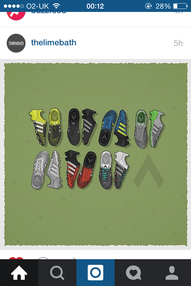
| Adidas Ace Colorways by thelimebath |
These are some vector illustrations by The Limebath on Instagram of the Adidas Ace football boot colourways that I think are pretty cool. Not just in the details but the layouts, in having both viewpoints of the boot (top down and side on) would be overlooked by some designers. They layout is also considered in that he has left some space on the end for the branding/logo for the Ace. The background is considered to represent grass with a white outline - similar to the chalk lines on a football pitch.
 |
| Branding alternative for the London Olympics 2012 by Studio Build |
This is a branding idea from Studio Build for the London Olympics using a hybrid of the Olympic Rings and the Interchange symbology from the London Underground map. It uses the Olympic Ring's as a base, with the interchange symbology extending away from this base. During the time of the unveiling of the London Olympics branding for 2012 by WolffOllins there was loads of homemade alternatives, but I think this is one of the smartest alternatives. It uses the London tube map which has become iconic of the city not just in the UK but all around the world which is important for the branding of an international sporting competition.
 |
| If you cover Helvetica it looks quite nice by unknown |
I think this is really clever and kind of funny. Obviously its a semi-redacted phrase which says 'If you cover Helvetica it looks quite nice'. It reminds me of the quote by David Carson - "Don't mistake legibility for communication", as the message is clearly not fully legible but it still communicates a message (even thought it might not be the same as the one written in image).
Also to me Helvetica is a great universal font but I dont think it's that exciting so I do agree with the partially obscured message, so that's why it's kind of funny. It's also kind of funny because Helvetica has become such an icon that even though half the letter is covered up, you can still make out that the font is Helvetica.