Wednesday, 18 May 2016

Visual Appendix

My visual appendix is a visual methodology/response to my essay on Harry Beck's 1933 tube map and the impact on the wider culture. My response was to use Beck's style to create a set of maps. These maps would be based on the layouts/stylings of London's Underground, Moscow's Metro, and the New York Subway maps. I created a set that would use the principles of these maps to interpret the physical geography of some of the UK's biggest cities in relation to each other. This would be a challenge as one of Beck's principles (perhaps the most radical) was to remove the literal geography of London in order to space out the stations equally (thus making the congested central areas easier to read, and bringing the outskirts of London in - making look as if they were closer than in reality).

UK Map - London Style

UK Map - Moscow Style

UK Map - New York City Style

The UK map in the style of London is probably the most accurate - or looks most like a real map. The Moscow style map revolves around a central circle that all over lines revolve around, so it's a little harder to map the points at the edges of the country, especially as I put the country's capital as the center point of my map.

The New York map is a lot looser, there is a less rigid structure, as in none of the lines have to fit to Beck's 45 degrees and straight rule, so the lines have a bit more a curve to them.

Personally I think that the London style map looks the most aesthetically pleasing, even if it's not the most functional map ever.

---

The second part of my appendix was to copy a similar concept to Simon Patterson's Great Bear - which saw Patterson use the same layout as the London Underground map but change all the station names and lines to non-geographical content such as philosophers, footballers, actors, saints etc. I used this mapping the abstract approach to make a map of me - mapping different aspects of my life such as football, education, aspirations, where I've traveled, my design inspirations among others.

Again I used London's Underground, Moscow's Metro, and New York City's Subway maps as a base for the layout but I did change up the layout.

Map Of Me - London Style
Map Of Me - Moscow Style

Map Of Me - New York Style

I think that the Moscow map looks the best because everything runs through the center and is much more balanced, and is the most abstract so fits the best. The London and New York styles are less good because they are more reliant on some physical geography to tie them together, whereas the Moscow one is easier to overlap with the central circle.


Tuesday, 17 May 2016

Contextual Portfolio, Inspiration / Stuff I like

Marching On Together by We Are Leeds
One City One Club by Matt McGough


On the left is an example of typography that I found on Facebook by a page I follow called We Are Leeds, they post all sorts of graphics to do with Leeds United. The colours match the club colours, and the typography is bold and masculine which fits inline with the clubs image as well as sport in general. The incline on the text could be a subtle subliminal message indicating the clubs rise?

I was inspired by this and with an interest in typography, I attempted to produce something in a similar style. I used the same colour scheme, as well as a square, angular shaped font. Leeds is unique in that it is one of the biggest cities in the UK to only have only one team, and I wanted to play on this. Using the "one city, one club" message I extended some of the characters to span across both lines. I also adapted the negative space inside the O to form the shape of the one. Again I used the slight incline to map the trajectory of the club.

Tough Times Pass, tough people last by unknown
I liked this piece of typography because I really like the message and think that its a great quote, and secondly I think that it works as a visual piece because of how eclectic it is. There's three or four different styles of type on here and with the other bits of decoration, it all just works together.

There is also a really simple colour palette to the piece, and this keeps the focus on the text and the objective of the piece rather than overwhelming or over designing the piece.


Arsena "Invincible's" by unknown
This is a poster, inspired by/based on a campaign ran by Nike following Arsenal's 2004/05 Premier League season which saw them win the league and go 49 games without a loss. Nike produced a poster that featured the form guide for the season, WWWWD etc followed by Arsena (Arsenal without the L) - seen as the season had no L's the clubs name went without as well. I liked this version better because it's more minimal, and each of the W's and D's all have the opponents crest imposed within the letterform - it tells you who Arsenal played in order in that season and the respective outcomes. I think this is really clever.

Homemade chalk typography by unknown

I found this on Pinterest. I like this because it relates to New York and the concept of the American Dream. Many European immigrants who immigrated to the US would have gone through New York in order to enter the US. The quote is a reference to that, and those pursuing a better life. Again I like this because it uses a couple of different lettering styles but the appearance is cohesive and effective from a visual point of view. From a linguistic point of view I think it really works as it uses the authoritative tone of voice with the 'free admission' and uses a more poetic tone of voice for 'to those who dream'. It then fits more into an advertising frame of reference for the matinee at 3 / twice nightly footer at the bottom. The word dream is the only part of the work that doesn't have a meaningful border around it - perhaps hinting that there is no limits on dreams.


Genius is 1% Inspiration ... -Thomas Edison by unknown

I like this poster because I think that it's simple and portrays a great message. I may have laid it out differently because I think it is a little bit confusing as to when you read the '1%'. But the typeface is great because its simply, it does its job, its nothing to fancy or complicated. The texture in the background adds a bit of depth and variety to the piece, just enough to create interest without being too distracting.

I also like the message that's being used because it encourages a strong work ethic, and that working hard is more important than talent alone.


Good design is all about... - Frank Chimero by unkown
This poster is really similar to the previous one but uses a different message, the words are coloured up slightly differently as well, and obviously the background colour is different from blue to green.

The posters are coloured up differently with the different messages but are in the same style, so that they can stand alone as individual pieces, as well as being hung together to be a range or collection of images.

The message is again another good, motivational poster for any designer, reminding them how simple design can be sometimes, just come up with an idea others may have missed.


Good artists copy, great artists steal - Pablo Picasso by unknown
I think this is another great poster, this time using the "Good artists copy, great artists steal" quote from Pablo Picasso.

This poster uses some art supplies to form some jail bars which some hands are grabbing - this fits with the alternative meaning of stealing. I like this piece because it's a little bit funny, has some great colours, and again is a gentle reminder of how to be a good designer maybe?
Marching On Together (Elland Road panorama) by We Are Leeds

Game carrier bag copy
However, I may have adjusted the type setting a little bit, softening up the typeface and maybe rounding it out to fit with the styling of the hands on the brushes. I would also have given the type some more space, increased the point size of Pablo Picasso so thats a little bit more legible.
David Villa / Every step you've taken has led to here by Matt McGough

Rhinos & United win by Matt McGough
This is another piece by We Are Leeds. I think this would make a great cover/banner photo for social media or perhaps a desktop wallpaper, as its very simple, featuring very few elements but still looks great.

All the main elements of the work are pictoral and visual so don't take much attention to decipher. The background picture has had its colours muted to make it fade into the background.

I like this because I think it looks good, whilst still being simple, and has plenty of ways to be used so its versatile.

This is a great, little simple idea. It's really subtle and would probably be overlooked by most people, as carrier bags are seen as very mundane everyday objects, but even everyday objects need designing as the right design on bags are great forms of advertising.

I like this because I think it's funny, and features great copy. It starts off with a warning - to grab people's attention and set the tone, but then I think that it lifts the tone with the rest of the text. Its obvious that the bag can't contain screeching tyres, or distant worlds - as they can't fit in it, but they may be contain within the games that are on sale in-store. The copy is well-thought out because it covers most of the game genre's that are on sale.

My David Villa photomontage, is one of my favourite pieces that I've made. It has a message that every step or decision we make leads us to where we are now, so I photoshopped on some images of David Villa's career such as trophy wins etc and put them onto a picture of him wearing his current clubs jersey.

Its a little bit rough and could do with polishing off, but I really like this idea/message.

This was a commemorative piece I created to celebrate Leeds Rhinos and United both winning on the same day in August. I used the same stripe that adorned the Rhinos special Challenge Cup Shirt to separate the two halves of the image, then I added the tints to the pictures - the colour of the tint was dependent on the main colour of the shirts won by the players on that day in August. I like this because I still think it looks great and was well received.
Leeds United Squad Number/Profiles by We Are Leeds

We Are Leeds created little player profile illustrations with the player name, number and a picture of the player. This has inspired me in the past to create something similar, using a different style and font for each player in the squad, as each player has a different style, personality and role within the club, and as such as illustration should be different. Again, each of the pieces needs to be unique enough that it works as a stand alone work as well as part of a range.

'Ya Beauty Antenucci' by We Are Leeds
This is the kind of graphics that I really like. I think this is a cross between photography, graphics and typography, and I think sometimes it is really hard to get the balance right between all three. Whilst the type is the focus of the piece it is in the background, there are features in front of it and behind, and the type also has certain appearance features such as subtle drop in the opacity or blending mode that means its a tiny bit transparent and you can kind of see the netting and people behind the text and the goal. All this in connection with the filter applied to the photo - I think this makes this a piece of art within sport - something that is on the rise. This is also something that I would like to emulate.


Adidas Ace Colorways by thelimebath
These are some vector illustrations by The Limebath on Instagram of the Adidas Ace football boot colourways that I think are pretty cool. Not just in the details but the layouts, in having both viewpoints of the boot (top down and side on) would be overlooked by some designers. They layout is also considered in that he has left some space on the end for the branding/logo for the Ace. The background is considered to represent grass with a white outline - similar to the chalk lines on a football pitch.


Branding alternative for the London Olympics 2012 by Studio Build
This is a branding idea from Studio Build for the London Olympics using a hybrid of the Olympic Rings and the Interchange symbology from the London Underground map. It uses the Olympic Ring's as a base, with the interchange symbology extending away from this base. During the time of the unveiling of the London Olympics branding for 2012 by WolffOllins there was loads of homemade alternatives, but I think this is one of the smartest alternatives. It uses the London tube map which has become iconic of the city not just in the UK but all around the world which is important for the branding of an international sporting competition.


If you cover Helvetica it looks quite nice by unknown
I think this is really clever and kind of funny. Obviously its a semi-redacted phrase which says 'If you cover Helvetica it looks quite nice'. It reminds me of the quote by David Carson - "Don't mistake legibility for communication", as the message is clearly not fully legible but it still communicates a message (even thought it might not be the same as the one written in image).

Also to me Helvetica is a great universal font but I dont think it's that exciting so I do agree with the partially obscured message, so that's why it's kind of funny. It's also kind of funny because Helvetica has become such an icon that even though half the letter is covered up, you can still make out that the font is Helvetica.

Thursday, 21 April 2016

Cinema 4D - Mapping textures

Today's process and production session took place in Cinema 4D and was based around Mapping textures on a few different objects.

We started by downloading the files Jay had prepared for us from unilearn. We started by opening the can shape in Illustrator so that we could prep it for use in C4D. This was just resetting the zero point in the document so that the 0,0 was at the base of the can and in the middle of the page. This makes it easier to convert the shape into a 3D object. The paths had to be saved as a legacy version of illustrator - illustrator 8, otherwise C4D wouldn't be able to process them,

The next step was to put the file into C4D. Once the file was in place, we had to take the paths out of the group that they were in. We then created two lathes from the sub-divison surface menu, the two paths were then dragged into a lathe each. This creates a 3D object from the paths, maintaining the height of the path and rotating it around the long edge, as if it were being spun on a lathe. This resulted in us having the can shape - complete with top.

We then created the floor and background using the tools in C4D, before adding a compositing tag to the floor. This makes the floor and background join seemlessly - giving a much more professional appearance. We then added a material to the floor and background to give it some colour.

Next we began working on the materials for the bottle. We made a new material in the material tray at the bottom of the work space. Keeping the reflectance turned on, removing the default specular layer before adding a new reflection (legacy) layer. In the settings we also added a fresnel property, changing it to dielectric and changing the preset to PET (a plastic). We also reduced the global reflection brightness and the global specular brightness to 50%.

As part of the colour settings you can add a texture - we did this to import the artwork for the can. This new material was then dragged into the lathe to apply it to the objects within.

Once this was applied we had to tweak some of the settings so that it would be right. We had to select the material tag, and change the projection to cylindrical, and turn off tiling. The last setting was to right click on the material tag and select 'fit to object', we selected yes when asked to apply to all subcontents.

We then made another new material and followed much the same process. Removing the default specular, adding the reflection (legacy) layer. But we changed the layer type to GGX, changed the roughness to 20%, and also tweaking the colour value in HSV so that it was v = 36 % - roughly. We then changed the global specular and reflection brightness's to 50% each.

We then dragged this new material into the second lathe for the can top.

Next, we added some studio lighting. The key light was set up at X 500, Y 1000, Z -500. We then rotated the viewpoint so that this light was sitting in the top left quadrant - as if it were over out left shoulder.

We then added the settting by going into the mode menu, finding the view settings and selecting view, before scrolling down to the shadows, and adding them to give a more real world application.

We then copied the key light to make a fill light, and changing the co-ordinates to X 500, Y 1000, Z 500, and dropping the intensity in the general menu to 50%.

We then added a third light - this time an area light. This light was placed at X 500, Y 40, Z -400, with a rotation at heading 45.

We then rotated the can lathe using the rotate tool to get the best angle of the can for the render.

To increase the shadow sharpness, you can change the shadow resolution in the light settings by selecting the light, going to project, and the shadows menu, and changing the resolution to make it sharper or softer.

We also increased the smoothness of the circumference of the top and can to make it more hi res by changing the object subdivisions to a higher number, and this helps smooth out the circle by increasing the number parts that it used to make up the shape.

Once we were happy with all the aesthetics of the render, we altered the render settings.
The output was set to A5 Print (portrait), frame range was set to the current frame only, the format was set to a high quality JPEG (with a quality of at least 85% - I choose 100). The anti-aliasing was set to best, with ambient occlusion turned on with the max ray length set to 50cm and a dispersion of 50%.


The next part of the session was spent creating a bottle, which roughly followed the same process as the can.

We followed the same process, setting up the Illustrator file for use in C4D, importing the file, and setting up the 2 lathes, as well as creating the seamless floor and background.

The first real deviation in the process was where we went into the content browser (which is in a tab on the far right hand side of the screen). We went into the presets - broadcast materials - glass - glass stained to find the right material for the texture of a glass bottle. This placed the stained glass material into the material tray at the bottom of the screen.

We altered some of the settings in the material - taking off the bump settings, changing the transparency refraction to 1.2, changing the absorption colour to white, and changing the HSV colour so that the V was 80%.

We copied the material and changed the colour to a pale yellow for the liquid - supposed to be beer. The glass material was added to the bottle and the yellow was added to the liquid.

We then created another new material this time, and turned on the alpha channel. We followed this by creating a cylinder with a radius of 73.5 and a height of 240 - this was to be the label band.

We changed the bottle lathe settings so that the number of subdivisions matched that of the cylinder which was higher - 36 - ergo making it higher res and smoother.

Back to the cylinder and we changed the caps so that they were off - creating a hollow tube.
Next we added the artwork for the label. In the cylinder settings, in the alpha channel you can add texture and we added a png mask of a beer label to create the effect of the label being in two parts - which higher quality brands use - rather than the single wrap around label which cheaper brands like Budweiser use. We had to use the invert option in C4D as Jay had masked off the wrong areas in his prepared file.

Even though the artwork seemed to fit, we had to alter the settings, to make it suitable if we had to change any of the sizes of the other objects. So we went into the material tag, and changed the projection to cylindrical, unticked the tile option, and fitted it to the object via the right click menu.

To make it look like the sticker was only printed on one side, we had to duplicate the material in the material tray, clear the texture in the colour menu, and reorder the material on the cylinder so that the new blank layer was underneath the artwork - giving the appearance that the back of the label is white.

To give it a more realistic appearance under the lights we removed the default specular, added the reflection (legacy), changed the layer fresnel to dielectric, and reduce the global specular and reflection brightness to 25%.

To make the bottle cap we had to make it from scratch in C4D. We started off by making a new document and creating a new shape. Using the pen tool menu to select the star shape. We altered the shape settings - object plane x2, with an inner radius 33, outer radius 37, with 20 points.

We then created series of 4 circles using the circle pen tool, the first with an inner radius of 33, the second with an inner radius of 29, the third had an inner radius of 17, and the last one had a inner radius of 0.

All these new shapes were then placed into a new loft within subdivision surface. The last 3 circles where then dragged up a little bit in the Y axis so to create the depth of the bottle cap. We then turned the caps off within the loft. Next we changed some of the object settings - changing the mesh subdivision U to 40, the mesh to 4 and the isoperm to 3, and switching the organic form on.

This was followed by creating a new cloth surface - this is achieved by going through the simulate menu to cloth and cloth surface. In the object settings we changed the subdivisions to 2, the thickness to 1 cm and we also switched the limit on.

We add the material as we had done previously. We added a bottle cap artwork/texture that Jay had prepared. We changed the projection tag to flat, and changed the artwork to fit the object, agreeing to apply it to all sub-contents. We again unticked the tile option.

We then used the texture mode from the left hand side of the screen. Using this in combination with the rotate tool we rotated the artwork so that the logo sat in the middle and top of the cap. This was made easier by holding the shift key as this moves the rotation in ten degree increments. We again fitted the artwork to the object.

We then collapsed the layer/object stack in the top right window and copied the object, pasting it in the bottle project. We then had to drag the bottle cap up in the Y axis so that it sat in place on top of the bottle.

The final stage was to export and render the images. This was the same process as the can, with anti-aliasing turned to Best, the ambient occlusion of ray length 50 cm and the dispersion to 50.


After the session finished, I spent some time changing the artworks and background to match some of the work I did earlier this year, expanding on Zombones range, branching into beer with Zombooze in the bottle and Zombjuice in the can. I also altered the slogans to match.


Thursday, 14 April 2016

Showreel Production

This Wednesday's process and production workshop was based around the production of a showreel, compositing all the After Effects works we've done this year, into one clip, as a way to quickly show off the range of skills we have, and garner interest, and point people towards an online presence.

We started by finding some background music, that fitted with our work as well as being suitable to cut between different videos to. We had to cut it down to the required amount, leaving it to run a little longer than the visual comp just to have a safe space to work in. The next step was to import all the footage we had made previously so that there was 50 seconds of content plus the music in AE.

The next step saw us move into Illustrator to create the title and end slates - something that would help start and end the showreel as well personalise the content to ourselves. For the title slide I used my personal branding, which includes my logo, colour scheme, and font family (Raleway).

To help with the branding, I added my name, and the title, as well as the year. On the endboard I added a copyright notice and a link to my other animation work on Vimeo.

For the structure of the reel, we were told to put a good piece of work - one that we would like to do more of in the future. This would then be followed by a better piece of work to show improvement. Any less good work would then follow this, before, building up the quality again before the finish. The end piece should be something that you would be willing to talk about - as if you were watching it with any potential clients or interviewers.

Once this was ready, we began to set up the timeline with the projects in them to the desired order, as well as matching them up with the music. I then went back and shortened the desired clips so that it would cut/transition to another piece of work. And added effects to the transitions because I felt this matched the music more.

Animation showreel 2016 from Matt McGough on Vimeo.

Wednesday, 16 March 2016

3D Communique 3

The third and final session from Deaks' 3D analogue communique session was focused on producing the final outcome. My time was spent sticking balls of cotton wool to fishing line in preperation for making a mosiac-like construction of the individual letters.

Given how long my original word of 'undefined' was I decided to use a shorter synonym to save time - as this was a lengthy process. I googled synonyms for undefined and settled on the word vague.


The next step was to set up the rig for suspending the balls of wool. This was done by spanning three lines of the fishing line between a wall of the studio and one of the fake wall/partitions that was hanging around the studio. The three lines were secured in place just by using the masking tape that was used to secure the fishing line to the cotton wool - as I can't really tie knot using the line.

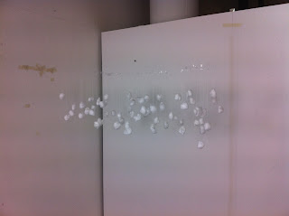
Then I started to hang up the bits of the wool from the lines. I started off with the middle letter so that I had a better judge of the spacing between the letters. The G was also the most complex letter to sort out because of the number of components involved, as well certain areas having three different levels on top of each other. I then worked outwards from this til the word was complete. I started by attaching the wool to the lines by tying knots, but this was too fiddly and changed to using some clear sellotape to preserve the lack of definition in any of the elements.This is an almost finished - process shot, without the E on the end.


These are some of the different viewpoints that show that the amorphic art works, as the word is indistinguishable from above, below, and from either side.


From this angle you can make out each of the different letters in the word.

I would have liked this effect to be more clear, but I think this would have taken days to set up, and it would have needed to be scaled up, in both size and number. Also I would have liked to use some stronger line because with even how little a ball of cotton woo and some line weighs, when its all combined together the middle of the line begins to sag. This meant that I had to adjust some of the pieces once they were all on, as well as constantly bringing the lines back to tension every couple of minutes. There was also a couple of times were the lines fell down because they were only secured by tape.

Friday, 11 March 2016

3D Communique 2.5

After the last session of Deaks' session it was agreed that I should try testing out my idea as a kind of proof of concept.

I went about this using some cotton wool, some fishing line, some masking tape, and some of the shelf space around my flat.

I started by trying to tie the balls to the fishing line using knots, but I struggled with this as the line was fine and the cotton wool would lose its shape when you tied the line tight enough to secure the cotton wool.

My next attempt was to unroll the balls of the wool, tape the line to the inside of the wool, and then roll it back up into a ball shape, hiding the tape on the inside.

Once I had repeated this process with a few different bits of wool to have enough to make the shape of one of the letters - in this case the letter U.

The next step was starting to hang it from the underside of a shelf. I did this just by taping the top of the fishing line to the underside so that the cotton wool dropped down. I did this again and again, moving backwards and forwards to create the differing level of depths, as well as moving to the side to create the shape of the letter.

I was pleased with how this looks as it really works with the idea I was trying to work with such, similar to amorphic art, where it only really makes sense from one particular point in the room.

Here is the front shot of the experiment and it shows that the concept works, as you can clearly make out the U shape from this angle, whereas you cant from the side shot.

Wednesday, 9 March 2016

Cinema 4D, session #2

We started the second session in C4D much like we did the first, by creating the all the necessary folders on the desktop, ready for all the content as and when it was needed, as well as establishing good working practices. Creating an umbrella/root folder which had three folders inside it, one each for the Artwork, Maps/Images, and output.

The next step was to start creating stuff inside C4D.

PART I


We started off the first part of the session just by creating a rectangle that sat within the XY plane. We then extruded this rectangle, changing the z-axis extrusion to 5,000 cm, whilst adjusting the subdivisions to 50 to add more polygons. To view these polygons we changed one of the display settings to gouraud shading (lines). 

We then adjusted the caps of the edges of the extruded shape to none on both the start and end caps.

The next step was to add a twist to the extruded shape, this is done by adding a twist, and then dragging it into the extrude. When this had happened we changed the settings of the twist, changing the angle to 10 degrees and the mode to unlimited. Using the co-ord values we also changed the rotation to 90 degrees.

Next, we created a new material, this is done by double clicking in the bottom tray. We ticked off the colour and relfectance settings and ticked on the luminescence settings. You can add a texture, and here we added a checkerboard pattern. To adjust the properties of this checkerboard, you double click the swatch. we changed the U tiles to 0 and the V tiles to 50.

Select the rectangle and go into the object menu and select the intermediate points option, changing it from adaptive to subdivided, adjusting the angle setting to 5 degrees and the max length to 5 cm.

This was followed by creating a sphere with a radius of 40 cm, at 0,0,0, with a pitch of 30 degrees and a bearing of 40. To this we added a new material, again with the colour and reflectance turned off, but with the luminance turned on. Again we added a checkerboard texture, but we changed one of the colours - I changed mine to orange. We also adjusted the frequency of the checkerboard pattern, this basically adjusted how small and frequent the lines were on this new material. The U frequency was set at 0, and the V frequency was set at 5.

We then turned on the reflectance, adding a reflection (legacy), then selecting the layer colour option, going to texture and selecting Fresnel.

The next step was adding a camera, at 0,0,0, with the heading, rotation and bearing all also set at 0.
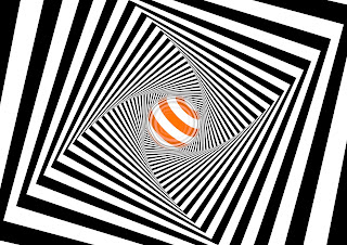
The final step of this part was to just render it. 
We opened the render settings, and changed the output to A4 Landscape, with a resolution of 300 DPI, the frame range was set to the current frame.
In the save options, we changed the format to JPEG, and altered the quality to 80% in the options. We also changed the anti-aliasing properties to best to sharpen and smooth some of the pixelated lines.


There was the option of adding Ambient Occlusion in the effects menu in the render settings, this added some realistic shading to the composition, most notable here in the joins between the faces of the rectangle.


Before the next part we altered the rectangle shape and changed it to a star shape. This is done by creating a star shape, roughly the same size as the rectangle, we used a 5 point with a inner radius of 75. Once created the star was dragged into the extrude layer and placed above the rectangle in the hierachy. Here is a rendering of this except I have adjusted the ambient occlusion to give a more pronounced shadow effect.


PART II


We saved the previous part and then saved as, to create a new file from the previous work, that would be overwritten without losing it.

In this new file, the first thing we added was a particle emitter which is done by going into the simulate menu, going to particle and then selecting the emitter. The emitter is automatically placed at 0,0,0, so we needed to shift it in the z-axis to sit inside the extruded tunnel shape. We set it to the value of 70 in z-space.

Some of the other settings we changed for the emitter was the particle - stop emission 200 frames, speed 200 cm, rotation 360 degrees , and we also ticked on show objects and render instances.

We then dragged the sphere shape into the emitter layer to make the emitter emit sphere's. We then changed the sphere settings as it was a bit big to have more than one of the sphere's in the tunnel at once, so we made the spheres smaller.

We then changed the emitter settings - adjusting the angle horizontal and verticle both to 60 degrees

The next stage was to add tags to the objects to stop them slipping through each other.
The extruded shape needs a different tag to the sphere. Select the extrude, then go to tags, simulation tags,and collider body.
The sphere needs to have a rigid body tag from the same menu and sub-menu.

Then we selected the extrude and went in the tag menu, but this time from the collision menu, the shape needs to be changed to static mesh.

In the mode window we changed the gravity settings to be a bit dynamic, going into the mode window, the project subsets, go to dynamics, then general and change the gravity setting to 0 cm.

You can alter the number of shapes that are produced by the emitter by adjusting the birthrate editor and render to suit the number of particles you want.


PART III


Part III was a completely new project within the context of todays session.

We started off with adding a floor to a new composition, and then a new background. We added a tag to the floor by selecting it, going to tags, then Cinema 4D and selecting the composting tag. We then had to tick on "compositing background", this would add a seemless join between the floor and the background, removing the line where the floor meets the wall/background.

The next step was to add some text, we did this by going to the MoGraph menu and adding MoText.
We started off by changing the font to one with a big serif such as Superclarendon, we changed the depth to between 50 and 60 - I chose 60, the caps were changed (both the end and start) we changed to fillet caps with 3 stepped corners/edges with radius' of 0.5 cm. We also had the option of changing the text - I changed mine to my initial M.

This was followed by creating a new material. This followed the same pattern as the other materials created today in that the colour was ticked off, but the luminance and reflection were turned on. 
The reflection was changed to add a reflection (legacy) layer. The layer colour was changed to a Fresnel texture layer.

Duplicate this material to make a new one, and with this new material double click to open the properites. In the luminance tab go to the texture option and select gradient. Double click this gradient swatch in order to open up the gradient properties. Next to the gradient bar there is a small arrow, which you need to click to open out. The interpolation needs changing to none, and the white flag needs moving in from the right to 80%.
You can drag this material onto the letter.
In the tag window you can change the tile settings, the U setting needs to be between 30 and 50.

Make another new material, this tie making it blue, and drag this onto the floor and background.

In the render settings, edit the anti-aliasing to the best option.

In each of the shapes you can edit the reflectance/how reflective the material is, by adjusting the Global reflection brightness to a lower value such as 50%, lighter tones will be more reflective.

Then we used the MoText tool, and the material tag to alter the projection option to preference, I chose the Spiral wrapping option. Next we added more text to the piece. Using the MoText tool, add a word that is a bit longer than the width of the initial letter, otherwise the effect isnt very good, and adjust the settings so that the word is smaller than the letter, by using a smaller height/point size. Using the cloner tool, clone this new word using a grid array. We altered this so that the settings were 1, 2, and 2, with a size of 700, 70, and 70.

Next, using the cloner tool, set this new grid array of text that it sat centrally above the first letter in the Y-axis, and using a change in the viewpoint make sure that the two ranks of words are sat directly above the initial letter.

Following this, you need to add the appropriate tags to each of the elements.
The floor, and the big, initial letter need collider tags (found in the simulation sub-menu within the tag menu), whereas the cloned text needs a rigid body tag.
In this rigid body tag there are options that need to be altered, there inherit tag needs to be changed to apply tag to children, and the individual elements option needs changing to all.


After the techinal side of this was all set up and working correctly, I went back and tweaked some of the settings, for example I changed the font to Raleway and the colours, to match up to my personal branding which is mainly orange, with white, and grey.


PART IV


Part IV required another blank file.

This started with the creation of 3 different polygons, 1 was 200 x 2, a second was 70 x 70, and the third was 3 x 200.

To accompany these 3 polygons, we were asked to create 8 new materials - all had colour and reflection off, with only luminance turned on. One had to be white, another had to be black, and the other 6 could have been any colour we chose.

This part of the session required the use of the particle emitter, so we added that in again from the simulate menu, but we had to change the rotational position of it to -90 degrees so that it was facing upwards.

The next step was to duplicate the square polygon 6 times, so that with the original included it totaled 7.

We then went back to the particle emitter and adjusted the horizontal and verticle angles so that they were both 60 degrees. We also changed the birthrate so that it was 20 and 20. The stop emission was changed to 200 and the lifetime to 500. The speed was set to 10 and the end scale was set to 1, both each set with a 20% variation.

This was so that the polygons would grow and move at different speeds with a certain degree of randomness. We then dragged all the polygons into the emitter layer. The show objects options had to be ticked on in the emitter options.

The final step of this part was add some text, for this we again used the MoText tool. The depth was changed to 0. The co-ordinates were changed to x=0, y=600, and the z=0, the rotational was set to -90 degrees. The text alignment, copy, and Y-positioning may need some fiddling with depending on what the copy is and personal preference.


---

When saving the files for animation the render settings need to be changed.

To save as an animation the output needs to be changed to "HDV/TV 720 25"
The frame range needs to be changed from current frame to all frames.
The format needs to be changed to QuickTime Movie, in the options menu, the compression needs to be changed from Animation to H.264 (and you can untick the keyframe option(s))
The resolution needs to be at 72 DPI to avoid massively long render times
Having the Ambient Occlusion can also slow down render times.